What Are The Two Quantitative Metrics In Data Augmentation? ~Affinity And Diversity~.
3 main points
✔️ Two metrics to quantitatively evaluate Data Augmentation ~Affinity and Diversity~
✔️ The model improves Acc when both metrics score high
✔️ Testing the effectiveness of turning off regularization with DA midway through the process.
Affinity and Diversity: Quantifying Mechanisms of Data Augmentation
written by Raphael Gontijo-Lopes, Sylvia J. Smullin, Ekin D. Cubuk, Ethan Dyer
(Submitted on 4 Jun 2020) (ver2)
Comments: 10 pages, 7 figures
Subjects: Machine Learning (cs.LG); Computer Vision and Pattern Recognition (cs.CV); Machine Learning (stat.ML)
code:
First of all
DataAugmentation (DA) is a technique to prevent overtraining of a model by augmenting the data, and regularization by DA is known as an easy technique to improve generalization performance because it does not require touching the contents of the model. Especially in the image domain, a large number of DAs have been studied and explored for each task. Among them, the optimal DA varies on a case-by-case basis depending on the task or the nature of the data. In particular, focusing on the image domain, DAs can be roughly classified into the following two types It is common to find the optimal DA by trial-and-error search of the following two types of DAs.
- Geometric transformation and optical processing of images. (Centercrop, rotate, etc.)
- Processes such as region deletion and blending (Cutout, Cutmix, etc.)
As for the geometric transformation in 1., by rotating the image, we can increase the training data to approximate the test data. For example, in the case of plant image classification, the shooting angle of the test data may be different from that of the training data, so rotation may be effective. Similarly, for optical transformation, brightness adjustment seems to be effective. The position of these DAs is based on the implicit assumption that the distributions of training data and test data should be similar to some extent.
But what about 2. Are the images created by Cutout and Mixup similar to the test data? In CutMix, which is a combined method, we can confirm that it is effective in various image recognition tasks, even though it produces data that is probably not included in the test image. In this way, we have recently found another finding that Augment, which deviates from the training data to some extent, can be effective in some cases. The effectiveness of DA, including this, is usually evaluated qualitatively on a case-by-case basis (CAM images, etc.), and the quantitative mechanism has not been well understood.
Affinity and Diversity: Quantifying Mechanisms of Data Augmentation," presented by researchers at Google Brain, provides a comprehensive overview of quantitative DA evaluation methods and the results are comprehensively presented. Specifically, two metrics for DA evaluation, Affinity, and Diversity, are proposed, and comprehensive evaluations of various DAs are made based on them. In this article, we explain this paper. (All the images in this article are taken from the original paper.)
Two metrics to evaluate DA
In the original paper, two metrics, Affinity, and Diversity are proposed as shown in the title of the original paper. To quote the text in the paper
1. We introduce Affinity and Diversity: interpretable, easy-to-compute metrics for parameterizing augmentation performance. Affinity quantifies how much an augmentation shifts the training data distribution from that learned by a model. Diversity quantifies the complexity of the augmented data with respect to the model and learning procedure.
Affinity quantifies the extent to which Augmentation shifts the training data distribution from the distribution learned by the model; Diversity quantifies the complexity of the Augmented data in relation to the model and the learned procedure.
(”Affinity and Diversity: Quantifying Mechanisms of Data Augmentation” p2 introductionより引用)
There is a
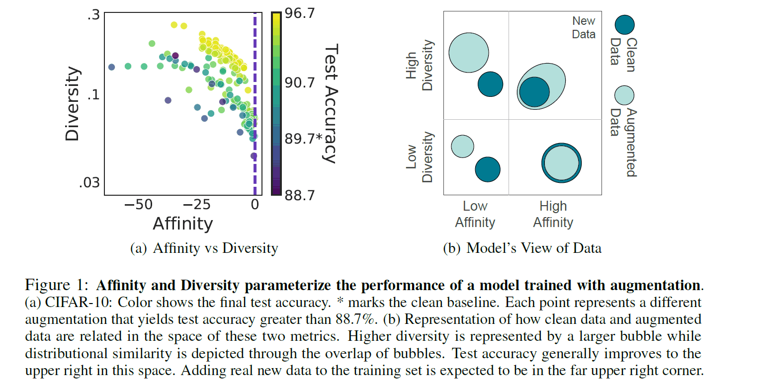
In order to interpret this metric intuitively, let's refer to the right figure above, where Clean Data refers to the distribution of unenhanced data and Augment Data refers to the distribution of data enhanced by DA. If we look at the diversity axis, we can see that the distribution of Augment data is wider in the case of High Diversity. From a practical point of view, this means that different kinds of complex data have been generated by repeated stochastic DA, and the distribution has become more diverse. Next, if we look at the Affinity axis, we can see that the Augment Data distribution overlaps the Clean Data distribution in the High-Affinity case. From the same practical point of view, it means that the data relatively close to the original data is generated and the distributions become affinity each other.
Let's take a look at the figure on the left to see how Affinity and Diversity can be considered good DAs. Each axis is metric and each dot represents an individual DA. The color of the dots indicates the Acc of the Cifar10 test data, where the color closer to Yellow means higher test accuracy. What we can see is that the dots that are closer to Yellow (DA) are distributed where both Affinity and Diversity metrics are higher. It is important to note that the test accuracy is not necessarily high even if only one of the metrics is high. Thus, in the paper, it is claimed that DA with high values of both metrics and a constant equilibrium increased the test accuracy.
Affinity
Let's take a look at each evaluation value. The calculation of Affinity is defined by the following formula.
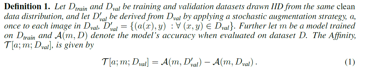
Here, from the text in the figure
"$D_{train}$, $D_{val}$ are training and validation data drawn from the clean data distribution. $D'_{val}$ is data drawn from the distribution of $D_{val}$ by Augment, $a$, with probabilistic DA. $m$ is the model trained on the clean training data $D_{train}$, $A(m, D)$ is the Accuracy of the model when validated by the dataset $D$, and Affinity is expressed by the following equation. "
with $D'_{val}$. Then Affinity is defined by the difference between the Acc of a particular model m validated by the extended validation data $D'_{val}$ and the Acc validated by the clean validation data $D_{val}$, as in the above equation. Here we can see that by fixing $D'_{train}$, $m$ in both terms, we are quantifying how the extended data $D'_{val}$ affects the accuracy of the trained model $m$. Instead of just evaluating the distribution of the input data, we measure the model-based distribution shift by tying it to the testing accuracy of the model. From this definition, we can confirm that the closer Affinity is to 0, the more affinitive it is, i.e. the effect of the augmented data on the model is the same as that of the training data. Of course, the formula confirms that Affinity does not take a positive value since it is verified by the augmented data $D'_{val}$.
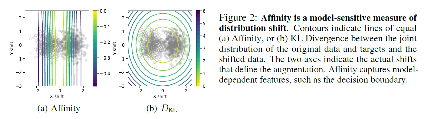
The above figure compares Affinity with the existing KL distance, simulated by a binary classification task with two mixed Gaussian distributions. The colored lines represent the Affinity and KL distances, respectively, and mean that the values are consistent on the lines. From this figure, you can see that Affinity is depicted as several vertical lines and $D_{kl}$ as concentric circles. The data drawn from the actual Gaussian distribution is shown by two kinds of dots, and it can be confirmed that Affinity is drawn like a decision boundary, while $D_{kl}$ is drawn in the direction not directly related to the accuracy of the model in terms of X and Y distribution shifts. This confirms the effectiveness of Affinity in capturing the features of the model.
Diversity
Diversity is then defined as in the following equation.
Here, from the text in the figure
$a$ is the augmentation, and $D'_{train}$ is the training dataset extended by the application of the augmentation $a$ based on stochastic strategies. Furthermore, $L_{train}$ is the learning loss of the model $m$ trained by $D'_{train}$. Then Diversity is expressed by the following equation.
in the model. Since the model's learning loss $L_{train}$ is the result of learning by $D'_{train}$, Diversity is defined by calculating the final expected value based on $D'_{train}$. After looking at the above two formulas, you may understand better if you omit the first Affinity and Diversity quote.
Analysis results of DA using both metrics.
In this paper, we use both of these metrics to perform a comprehensive analysis of various DAs. Specifically, the following three metrics are used.
- Quantitative evaluation of both metrics in conventional DA
- Verification of the effect of turning off the regularization (DA) in the middle of the process.
- Comparative evaluation of static and dynamic DA
Quantitative evaluation of both metrics in conventional DA
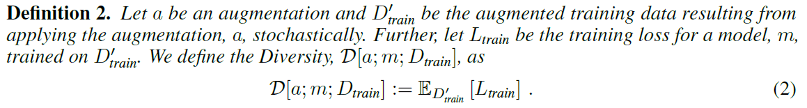
In the paper, Affinity, Diversity, and Test Acc in various DAs are calculated for the CIFAR-10 and ImageNet datasets. The above figure (a) shows a two-dimensional plane where each metric is evaluated independently. Let's look at the top row (CIFAR-10). The blue dashed line is the baseline of the clean data, and the light blue dot is the DA beyond the baseline, but it can be confirmed that TestAcc is not necessarily linked to one of the metrics. It is more obvious when we look at the Affinity of the lower line (ImageNet). Figures (b) and (c) below show a three-dimensional diagram with both metrics represented on the vertical and horizontal axes and TestAcc represented on the color axis. (When affinity is the same value, TestAcc is higher when Diversity is higher, and vice versa.
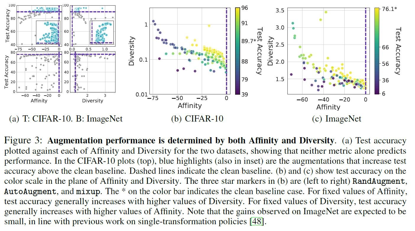
Verification of the effect of turning off regularization (DA) in the middle
The paper also explains the experimental results when DA is turned off in the middle. Recently, it has become clear that switching regularization on and off (or changing the degree of regularization) at specific times can improve the model (weight decay is one kind of regularization). In this paper, DA is considered a kind of regularization. Please refer to the original paper for detailed background and results.
The upper row of (a) above shows the case where DA (in this case, rotate) is turned off at 55k iteration (Turn Agg off) during the training of CIFAR-10. It can be seen that the score of Valid Acc is improved compared to that of Constant Aug and Baseline. This is called the Slingshot effect in the original paper. This indicates that even a DA that is not effective for Constant can become effective beyond the baseline by switching it on and off in the middle. In addition, the other results in (a) show the results obtained by switching another regularization different from the DA in the middle. Next, (b) shows the comprehensive results when the various DAs are turned off in the middle. It can be seen that the TestAcc is generally improved when the DA is turned off in the middle of the test (blue line), rather than continuing to turn Aug On, even when the DA is below the baseline. This improvement is called "switchoff lift" in the original paper. In the above figure (c), the magnitude of the switchoff lift is also correlated with Affinity and Diversity.
Comparative evaluation of static and dynamic DA
In the paper, as in the following sentence
"Unless specified otherwise, data augmentation was applied following standard practice: each time an image is drawn, the given augmentation is applied with a given probability. We call this mode dynamic augmentation. Due to whatever stochasticity is in the transform itself (such as randomly selecting the location for a crop) or in the policy (such as applying a flip only with 50% probability), the augmented image could be different each time."
(”Affinity and Diversity: Quantifying Mechanisms of Data Augmentation” p3, 3.Methodより引用)
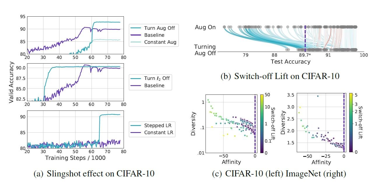
Standard DA, in which a particular image is transformed based on a probabilistic strategy, is called dynamic DA. On the other hand, the ones that do not take any probabilistic strategy are called static DAs.
In the above figure, it is shown that static DAs without probabilistic strategy is less accurate than dynamic DAs with probabilistic strategy. From the left figure, we can see that the static DAs always have relatively inferior TestAcc scores compared to the dynamic case (no DA comes below the black dashed line). It is suggested that this may be due to the fact that static DAs are also lower in Diversity than dynamic DAs, i.e., they have less diversity, as shown in the right figure.
Summary
In this article, we discuss "Affinity and Diversity: Quantifying Mechanisms of Data Augmentation" by Google Brain researchers, who are the first to quantitatively analyze the mechanisms of DA. which is the first quantitative analysis of DA. The author thought that such quantification of DA can clarify the mechanism of DA itself and lead to the acquisition of knowledge not only on DA but also on regularization as a whole, which embodies the depth of machine learning. In addition to proposing DAs based on qualitative evaluation, I have a feeling that in the future there will be a trend of proposing new DAs from a quantitative perspective based on these two metrics.


Categories related to this article